Imagining Apple's Brand Identifier. Speeding up the brand identifying process.
Role: The sole UX designer who was responsible for everything from the researching and wireframing, to the designing of the overall look and flow of this entire product, and then finally creating a functional prototype.
Industry: Online Shopping
Created:
-
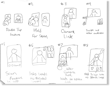
32 rough ideas (Crazy 8s)
-
10 paper wireframes
-
14 Figma screens
-
A functional prototype
Duration: 2 weeks
1. Problem
I asked myself:
What could I design to speed up the brand identifying process?
How can I create a new feature for Apple that follows their brand guidelines?
So what's the problem?
IT TAKES EIGHT STEPS TO GET TO THE END RESULT!
-
You have to scale the image to find the specific things you're looking for.
-
You finally get to the item you're looking for, but you have to CLICK TWICE in order to actually go to the webpage.
-
If you want to select a different portion of the image instead, you must click the back arrow THREE TIMES to get back to your image. Then you have to go back and resize the zone on what portion you want to search next.
And lastly, people didn't know you could go from your gallery to Google lens! Why is such a cool feature hidden under the share icon? So, I asked myself, how can I improve an existing system?
Let's do a deep dive on how I uncovered these problems and what I came up with to solve them!
2. Research
In order to determine how I would improve a pre-existing system, I decided to look into Google Lens and look into the current issues with their navigation, understand user needs, and uncover a feature that could improve the functionality of Google Lens. But before I did that, I wanted to create Crazy 8's so I could determine how I could potentially solve my problem.
Crazy 8 Ideations:


Low- Fi Ideation made me wonder..
After coming up with 32 ideas within 24 minutes by conducting rapid ideation through the crazy 8 method, I was able to conduct research by running user tests on Google Lens.
Google Lens Navigation:
Collecting insight
After discovering the current flow, I tested it on 3 users. I would have them conduct 2 simple tasks:
1. Find the most similar jacket
2. After that, go back and find the most similar pants.
From each of their tests, I got these 3 interesting insights.
Alexa Young
"I can find stuff through the iPhone gallery? Where? Oh it's under the share button."
Oz James
"It takes so long to find the exact jacket. I already found what I was looking for, I don't really care about these other jackets."
Thelma Driver
"Ok I found the jacket that's sort of similar, where do I click next. I tried click on the picture but its not working. Oh wait, there's a visit site button."
The Solution: Get to products faster
Based off their feedback, I concluded that I needed to create a quicker experience with less steps, which would take them directly to the site that had their branded item. So, I looked at my Crazy 8 ideas and decided to design a scan feature that is a part of the photo gallery in order to find brands quicker, instead of having it hidden under the share button.

3. Design
Next, I designed med-fi wireframes and created a potential user flow using paper. Then I put my designs in an app called Marvel, which was a prototyping app where you could add interactions, creating user flows. Doesn't mean everything went smoothly though.
Paper prototypes developed from the best Crazy 8 idea
After selecting the best idea from my Crazy 8s, the next step was to create a paper prototype that shows two potential user flows of how they would scan an image to find an item. I did this by using a paper prototype mobile app called Marvel.
I drew 2 different flows of how the user can reach their goal of finding a product. The first flow shows how you start in the brand identifying process and the end result , while the second flow shows how a person can make a different selection in the image in order to get a different result.

Challenges I faced, including design concepts that were ultimately not pursued
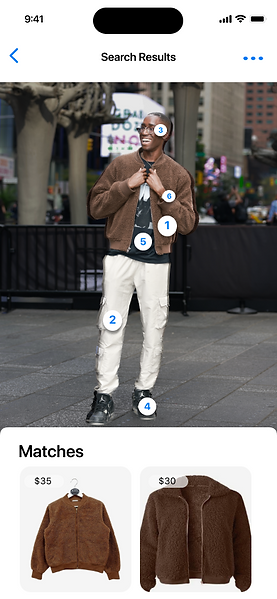
During my ideation process, I had numerous design concepts that didn’t make the cut. One concept I came up with was implementing the crop feature in order to achieve selecting the desired area to be scanned, but it ultimately wasn’t pursued because when running user tests on my paper prototype, users had issues navigating to the next desired clothing item. They wanted it to be more obvious that the different clothing items brands could be pulled up in the search. So, I decided to implement the cutout feature that came with the new update to separate the selected area from the background and establish a stronger foreground, while also putting dots on the item that were detected in order to toggle different options.
Some other challenges I was able to overcome was implementing the in/out of stock feature and making it more prominent on first glance as well as making sure the price tag element looks like its apart of the Apple interface.
Old:

New:

My Final iPhone Designs:
After collecting research, creating wireframes, developing a mid-fidelity prototype, and testing it on users, I developed a high-fidelity prototype that highlights two different flows of identifying a brand through the iPhone system.


Takeaways: How the project affects users and the business
Now that the users are able to access the brand identifying feature straight through their photo gallery, they’re now able to not only navigate to a desired product faster compared to Google Lens, but they are also able to navigate to the product detail page on the original site instead of having to click multiples times.
With this new feature, Google can gain more profit from having sponsorships from brands that want to appear at the top of the search, as well as quickly linking users to making purchases straight through their interface. Apple also benefits from this feature because it improves their gallery UI by including an icon that takes the user straight to scanning feature instead of having to click on the share button, and scrolling all the way down to the bottom to search in Google Lens.


